The 5 Kitchens That Helped Us Design Ours
When it came time to design our kitchen, Marco and I looked tirelessly through design books and Pinterest for inspiration. We looked at kitchen layouts, materials, lighting and cabinetry to name a few. We saw TONS we loved, each one for a specific reason, and when it came down to it, these were the top 5 images we kept referring back to...
Kitchen No. 1
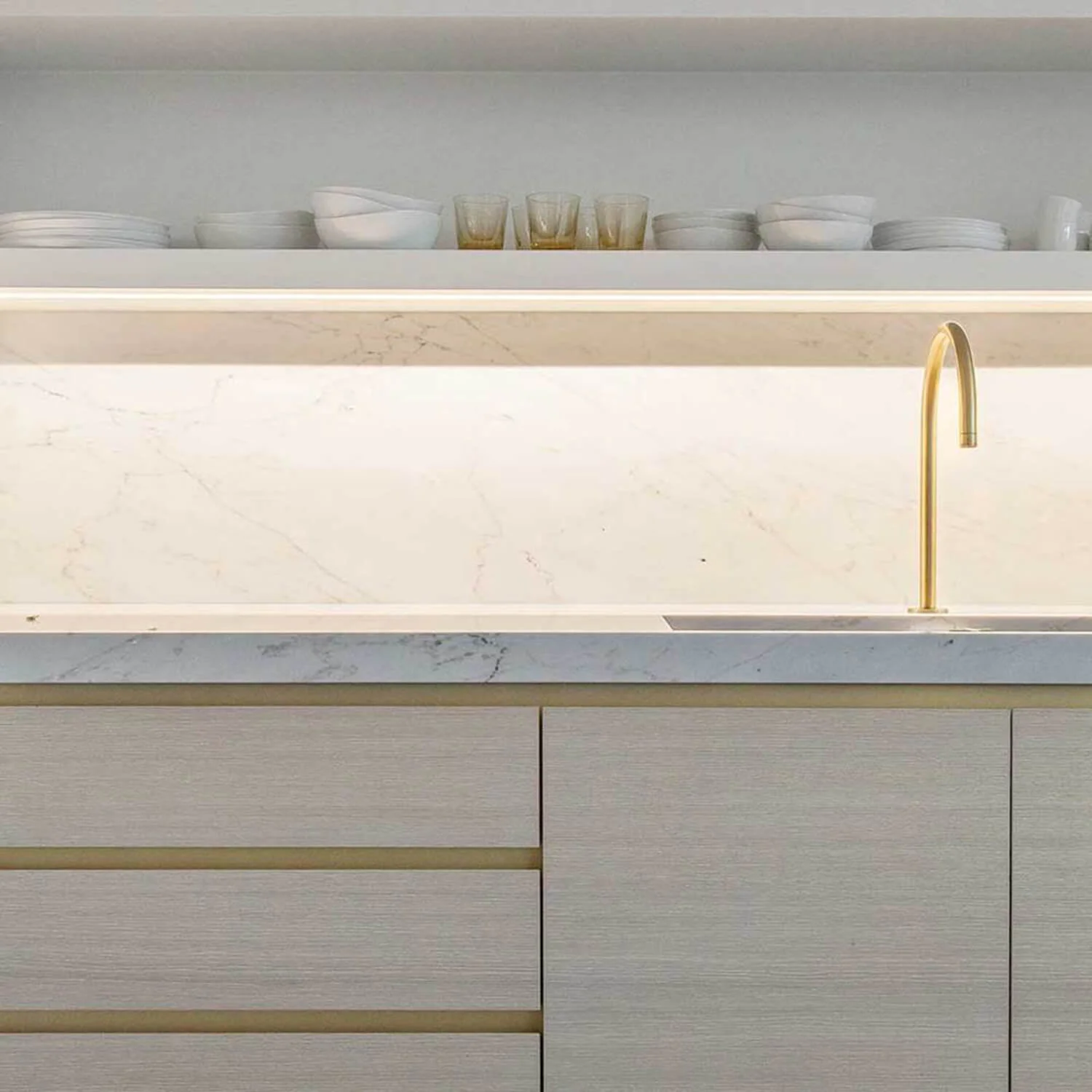
When we came across this picture, we just had to save it. It’s clean, minimal, streamline aesthetic was always something we had wanted to strive for, so when we saw it, we said “Bingo!…this is it!” We took a lot of inspiration from this one, some of which were the thick square countertop, single-mount faucet, under-mount sink , thick wall-mounted floating shelves and flat front doors/drawers.
Kitchen No. 2
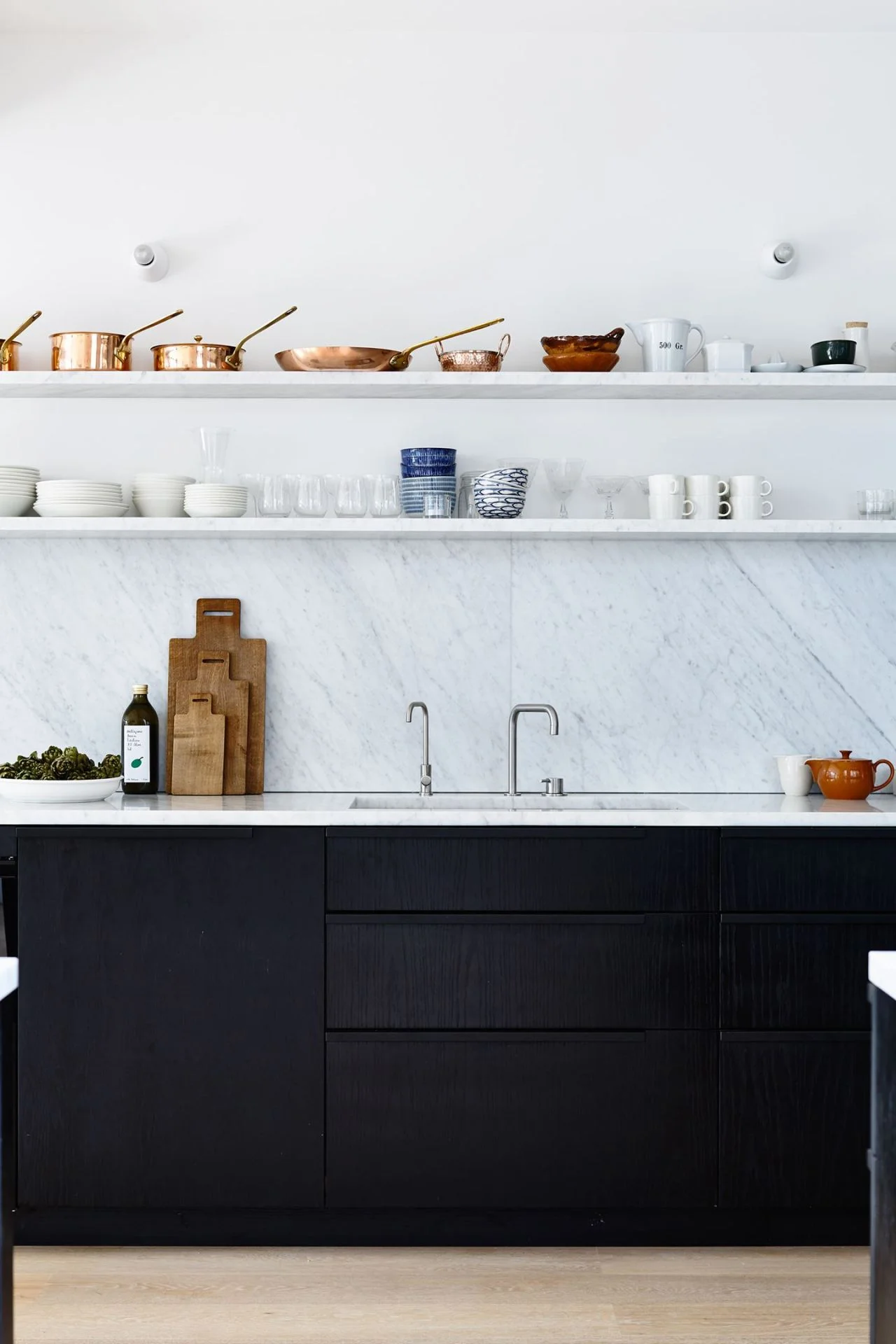
We also really LOVED this kitchen! Another similar concept to the first image, however when we saw that they put drawers under the sink we knew we had to do it in ours...so practical and comfortable! That was a game changer for us, and to this day I’m so glad we did it.
Kitchen No. 3
This image was important to us because we had gone back and forth about a hundred times whether or not we should have 2 or 3 floating shelves. Our ceiling height is similar to this kitchen so when we saw how much space there was above the top shelf we knew we'd be fine with 2. Adding a third shelf wouldn't have given us the flexibility we wanted when it came to styling them.
Kitchen No. 4
Let’s take a moment to appreciate all the subtleties going on in this kitchen (sigh). This whole scandinavian vibe going on is perfection. Although we loved EVERYTHING in here…what drew us specifically to this kitchen was their use of track lighting above the dining table. Our kitchen isn't anywhere near the size of this one, but by implementing track lights, we were able to give the illusion of a taller space, as well as give us the flexibility to illuminate the items on our shelves.
Kitchen No. 5
In this kitchen we loved how they lined their shelf to the hood. When we made the decision to have floating shelves throughout, including either side of our hood, we chose a more modern hood with a flat base to re-emphasize the linear language throughout.
[Check out our kitchen Before & After here]
LOOK AHEAD: How we styled our kitchen, what's behind our super tall pantry towers and more! Stay tuned..


