BEHIND THE DESIGN | our kitchen renovation
We all love before and after posts because, let's face it, who doesn't love a good transformation!?! What most people don't see, however, is the real technical work that goes on behind-the-scenes. There are TONS of schematic sketches that go through revision after revision before a select few get developed digitally. Even then, it continues its transformation with yet more phases of revisions. As an Interior Designer, I like to think of the spaces I'm working on as one large puzzle piece. It takes some trial and error, but in the end everything falls into place. Time and experience has taught me that I'm satisfied with my design when everything makes sense; in other words, when the pieces to my puzzle are in their appropriate place.
When it came time for us to design our kitchen, the process was no different. We sketched and tweaked and sketched some more! I narrowed the process down to three phases: how it was, what we changed, and what it looks like now...
how it was
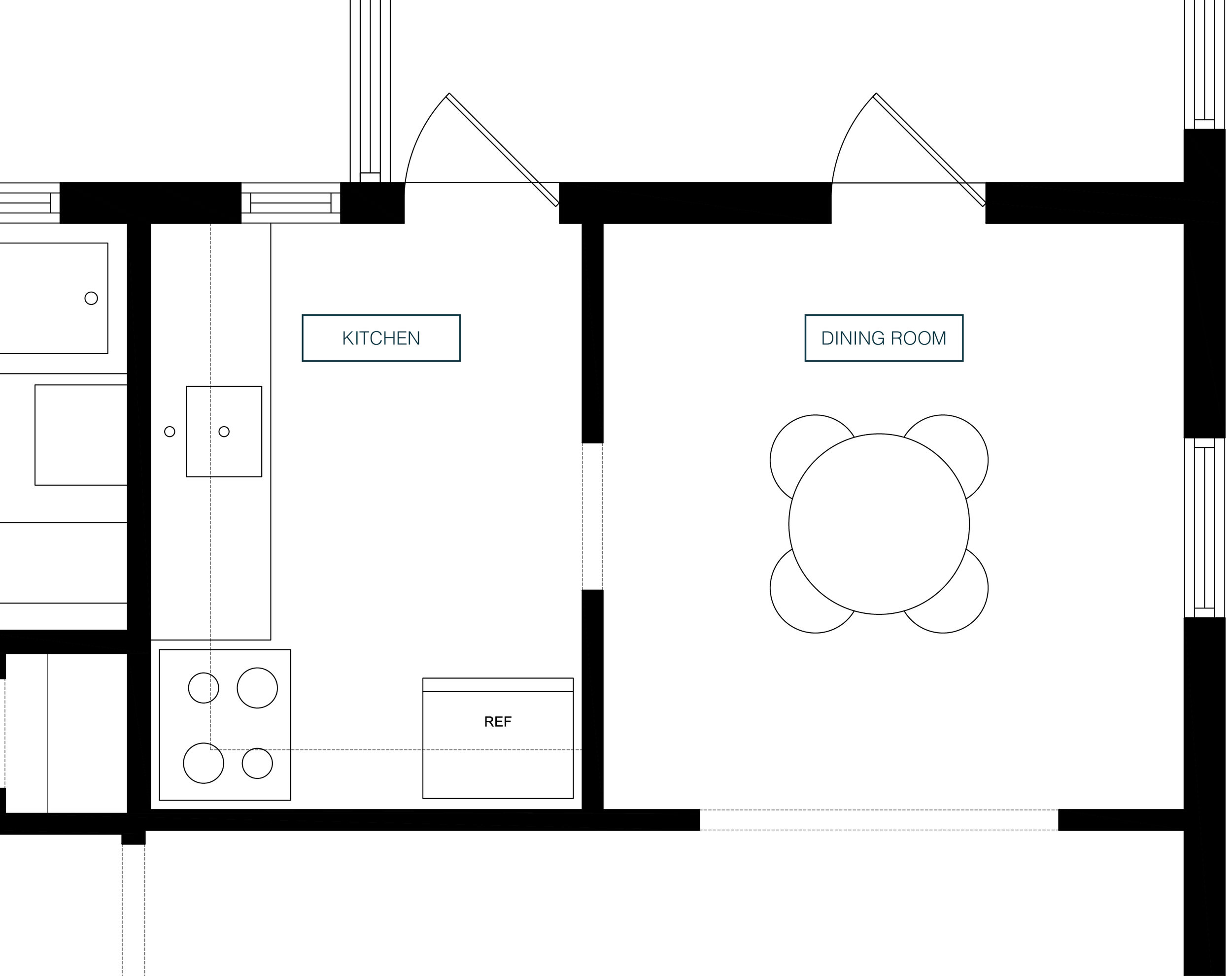
ORIGINAL FLOOR PLAN | KITCHEN + DINING ROOM
In the original floor plan, the kitchen and dining area are in two separate rooms. The kitchen felt dark, tight and laid out inefficiently. The dining room had no issues, however, we wanted to integrate the two spaces with the living room. Here's what we did...
what we changed
ORIGINAL FLOOR PLAN | KITCHEN + DINING ROOM
- We removed and filled the back window and door in the existing kitchen in order to maximize wall space
- We removed the kitchen sink, all existing cabinetry and flooring
- We knocked out the wall that divided the kitchen from the dining room, as well as part of the wall that divided the kitchen from the living room
- We extended the wall at the entrance of the dining room 11 inches to the left to allow for two 24 inch deep storage towers
CHALLENGEs WE FACED...
When dealing with a renovation there are certain limitations one has to work through due to existing conditions. One challenge we had was realizing we couldn't have our sink in front of the window. The window in the former dining room was set too low and would've had to have been installed higher to allow for a 36 inch high counter in front. The expense to remove and replace the window would have taken a nice chunk away from our budget, so we decided to locate the sink along the back wall instead.
The other challenge was coming to terms with a U-shape plan; a plan where the dining table wouldn't line up with the window or range. If we centered the dining table to the window we wouldn't have had room to work while people sat around the table. Centering the range to the window would have also left us with insufficient counter space to the left and uneven lower cabinets on either side.
HOW WE RESOLVED THEM
We also had to consider lighting. How do we light the space? Which type of lights do we go with? Do we add pendants? Wall sconces? High hats? Track lights? I mean...the options are endless really. In the end, we went with the track lighting for two reasons: 1. They gave us flexibility with what we could shine light on 2. It determined the placement of our dining table.
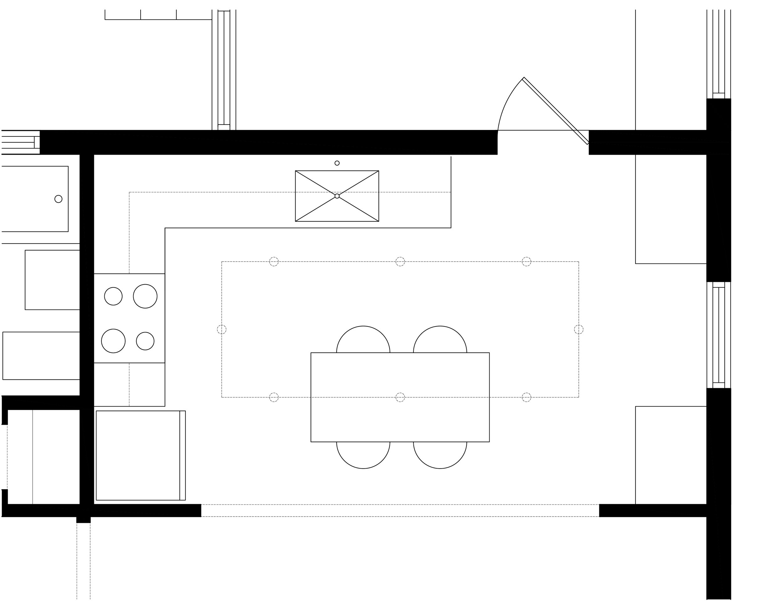
The rectangular track gave us the flexibility to light every wall in the kitchen, as well as provide light directly above our dining table, casting an even shadow from above. By placing the dining table directly under the track, it allowed us to have 32 inches of circulation between the counter and the back of our dining chairs; making it comfortable to wash dishes while guests hang out around the table. We also went ahead and repositioned the range to have two equal cabinets on either side. Although the range may not be centered to the window, it is balanced along the wall.
WHAT IT LOOKS LIKE NOW
FINAL FLOOR PLAN | KITCHEN + DINING ROOM
Here she is! :D By opening up the kitchen and dining into the living room we were able to utilize the footprint of the kitchen more efficiently. We added two floor-to-ceiling towers, one as our pantry and the other as our bar. We also added a larger sink, garbage disposal, dishwasher, hood exhaust, lazy suzan and a lot more shelf & storage space! The kitchen, dining and living room integrate together so comfortably that our house has become the Friday night happy hour spot for our family and friends and we wouldn't change it for the world!
[ TO SEE BEFORE + AFTER PHOTOS OF OUR KITCHEN CLICK HERE ]
LOOK AHEAD: The 5 kitchens that helped us design our own, how we styled our kitchen shelves, what's behind our pantry towers and more! Stay tuned...
Have a question or comment? Share it below :)


